|
This is the first post in what I hope is going to turn into a regular behind-the-scenes-ish series about my designs. I want to peel back the layers and share where I started and where I finished. What my process is. How I come up with color palettes and where I find my resources. I hope you enjoy it and maybe even find it helpful for a project you work on someday. 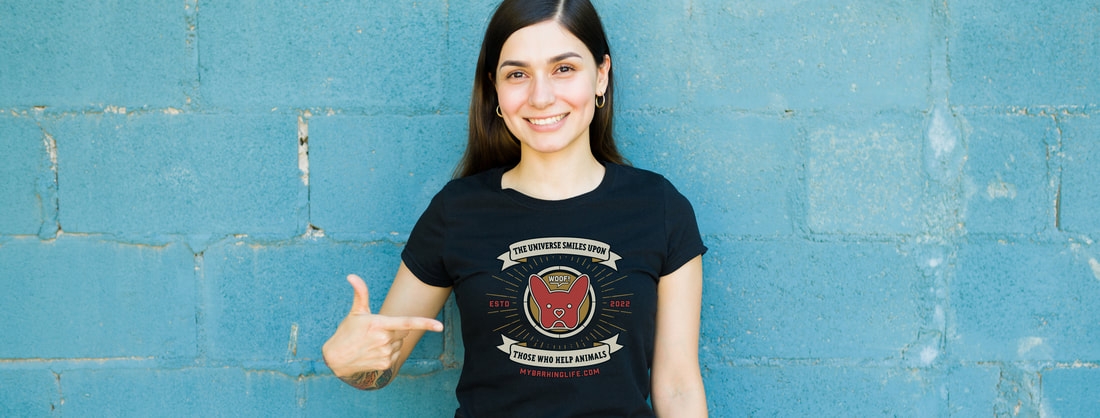 Two years ago, I started a little side endeavor called My Barking Life. The original goal was to connect people with shelter pets, but it very quickly evolved into a philanthropic effort. I started creating original dog breed-themed wall art, then expanded my offerings to include custom pet portraits, and eventually added animal-themed merchandise that I sell on a couple of print-on-demand platforms. I donate a portion of the profits from every sale to organizations whose goals align with mine: to help animals in need. And I can honestly say it's been a long, strange—but beautiful—trip. I've met new people, made new friends (both human and animal), and learned a LOT about myself. I found my North Star and my purpose.
I don't consider myself to be a great designer. I don't even know if I'm a good designer. What I do know is that I like designing, and people seem to like what I create. So, in a way, isn't that what art is about? Creating something that people respond to? I know that when I was just starting out as a young designer, hearing from someone about how they approached a project might have been helpful to me and may have helped me gain some insight into the process instead of developing anxiety and spinning my wheels. If I can help someone jumpstart their career, isn't that the point of life? To help lift others up so that we all succeed? So let's dive in! THE GOAL + MESSAGE
I love the band Khruangbin and had been listening to their new album (are they still called albums?) a lot. They're super fun to see live, so check them out if you ever get the chance. One of my favorite songs by them is "People Everywhere (Still Alive)" from their album The Universe Smiles Upon You. I can listen to it on repeat every day until I die and not get tired of it. And I love the message in the album's name. The album itself has been described as 'a subtle dance, a constellation of small movements, and highly nuanced arrangements...' PERFECT! So I tweaked the text to include animals and now had my message for the design: The Universe Smiles Upon Those Who Help Animals. Be good to animals and the universe will be good to you. THE INSPIRATIONMy day job includes managing a brand and having to adhere to pretty rigid design guidelines, so maybe it makes sense that I'm not that strict when it comes to my personal brand. I think that people recognize the Nike swoosh regardless of what color it is. They don't recognize the fonts Nike uses in their ads and might not know the company's mission statement, but they know that the swoosh means fitness and athletics. And everyone knows their tagline: Just do it! Because I am a rebel [narrator voice: she is not a rebel] I play a little fast and loose with the identity for My Barking Life. The logo is my French Bulldog, Bisou, and "WOOF!" is my tagline. I feel that by using those two elements consistently across products, regardless of color or style, they'll become my swoosh. The version of my logo used on this shirt was inspired by art for the Railbird music festival. I saw a promo for it on Facebook and was instantly smitten with the feel. I loved everything about it. For most projects, I'll put together a mood board comprised of various elements that I want to channel, but this was all I needed.
 THE COLOR PALETTEI design in RGB. I know it's counterintuitive to everything we are ever taught as designers, but it works best for the types of art I create. I have a large format Canon TA-20 printer that I use to output my giclée prints and noticed early on that if I designed in RGB, what I had on my screen looked identical to what I was printing. And all of the print-on-demand vendors require RGB files as well, so everything I create outside of work is now done in that color space. It doesn't always work out that my inspiration for look and feel also works for color as well, but the palette used in the Railbird art was nearly perfect for the look and feel I was trying to achieve. I did end up softening the gold a bit to make it a little vibrant, and I tweaked the red so that it wasn't quite as orange. Here's the final palette:
THE FONTS
For example, if you use distressed yellow text on a dark blue shirt, the vendor will apply a white underbase to help the color pop and every once in a while, the two layers won't align perfectly so you'll get a white edge. It's not awful, but it's rarely the look you were going for. So while I loved how they handled the text in the promo, I knew it wasn't going to work well for me in the end. I knew I wanted to use a heavier slab serif face for the main message since anything dainty, fancy, or with delicate points wasn't going to play well on top of another color. I tried dozens of fonts but went with Triplex Condensed Serif from Emigre. It was heavy without being overbearing, and still had a little playfulness to it. Even though it has those chunky slab serifs, there are curves to the lines that soften its appearance. If you happen to have a subscription to Adobe, it's one of the fonts available to you through the Cloud. Since the "WOOF!" tagline stands out in the design, I opted to use that same typeface—Northwest Round—for the accent text. Even though it's sort of a busy design, I think it still reads as being cohesive because of the simplicity of the fonts. You can snag the font for $9 at youworkforthem.com. ROUNDING IT OUTWhen I created my business, I knew I was going to need a source for stock assets. There are times when even the best designer needs a quick starting point. I look at it as the microwave for design. Yes, you can bake a potato in the oven but it takes 4x as long and really doesn't taste significantly better than if you used the microwave. I subscribe to Freepik and would recommend it to anyone looking for a resource for things like that. They've got an extensive selection, including Photoshop actions and video clips, and I know that I can take something from there, edit it, and make it into something that's my own. It's where the background burst and banners came from. THE FINISHED PRODUCTI use Illustrator to create my merchandise and apparel. I love how they've made the integration between their apps virtually seamless. I can easily copy and paste elements from InDesign into Illustrator or Photoshop, which comes in handy for creating promotional mockups. I used the Upper and Lower Arc effects under Effect > Warp to get the bends on my text. I think both worked at around 15%. I also tweaked the Northwest Round text and set the horizontal scale to 110% to have it take up a little more space. FINAL WORDSAs I said at the beginning of this post, I'm not a great designer. But I have fun, and that's what matters. I'm challenging myself to not overthink things. I have a tendency to let perfect be the enemy of the good and to be overly critical of whatever it is I'm creating. And all that does is prevent me from moving forward. And that means that one less animal might get the help it needs.
Every designer/artist's journey is different. Trust your gut and have fun. If you believe in what you're doing, others will too. I hope you liked this post and found something in it to be helpful to you. If you have questions about anything, leave me a comment. If you like the design and want to pick up a shirt, tote bag, mug, or sticker, please visit my Threadless shop. I donate 50% of the net profits from every merchandise sale to the Coshocton County Animal Shelter & Humane Animal Treatment Association. Until next time, WOOF! #branding #design #designtips #dogart #dogartist #petartist #threadless
0 Comments
Leave a Reply. |


© My Barking Life 2022. ALL RIGHTS RESERVED.